Tenify Branding
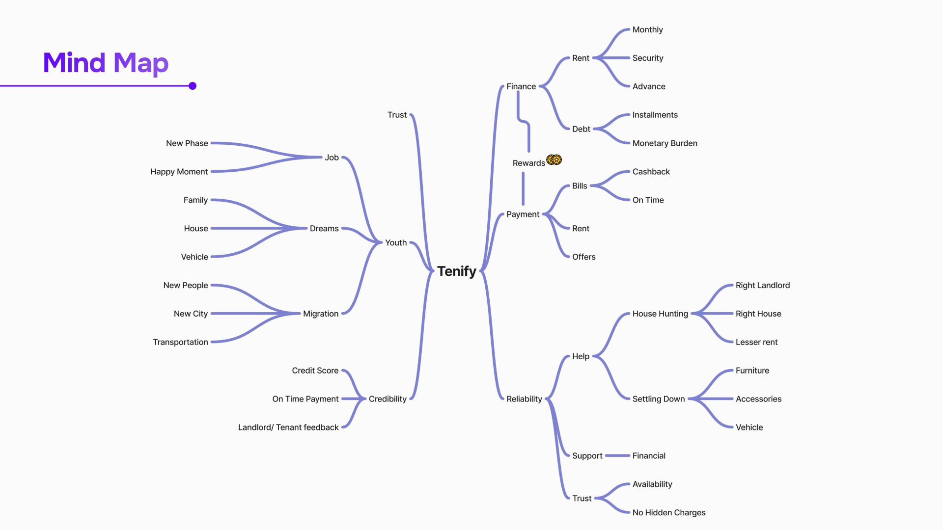
Tenify specializes in helping young, aspiring tenants move into their dream homes faster and more easily. Tenify simplifies your financial needs related to renting, making heavy payments more manageable and ensuring you pay your bills and rent on time.
01
Brand Positioning
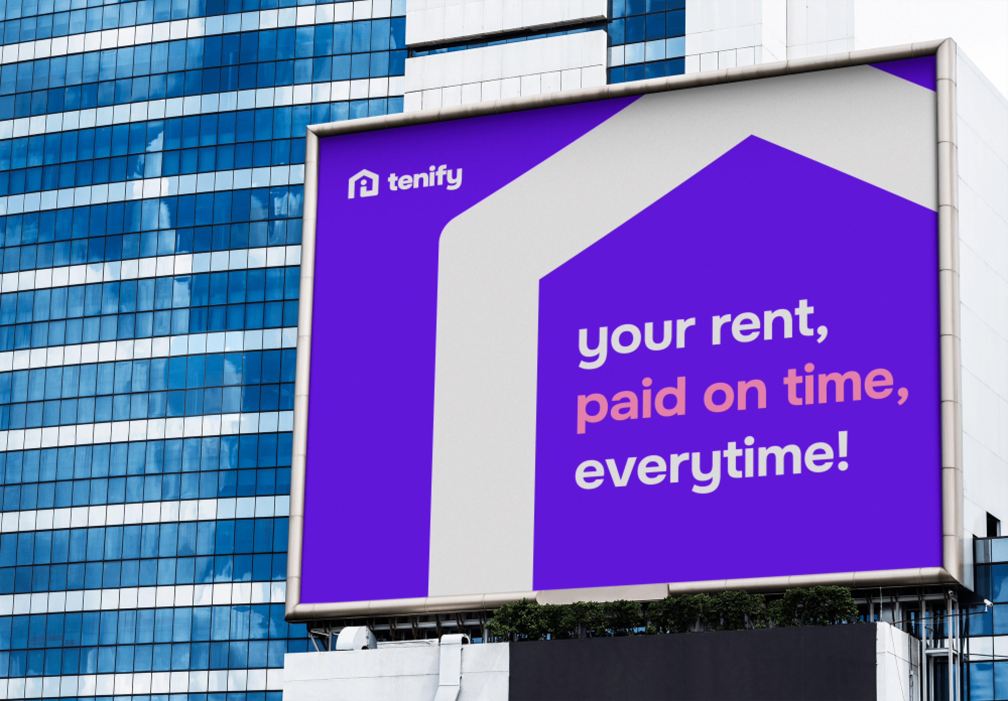
Our brand is focused on making financial transactions and management easy, fast, and secure. We want to be the go-to app for young professionals who are always on-the-go and want to stay in control of their finances.
02
Brand Identity
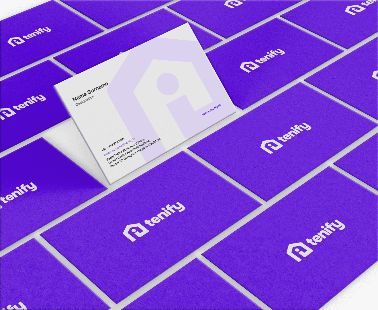
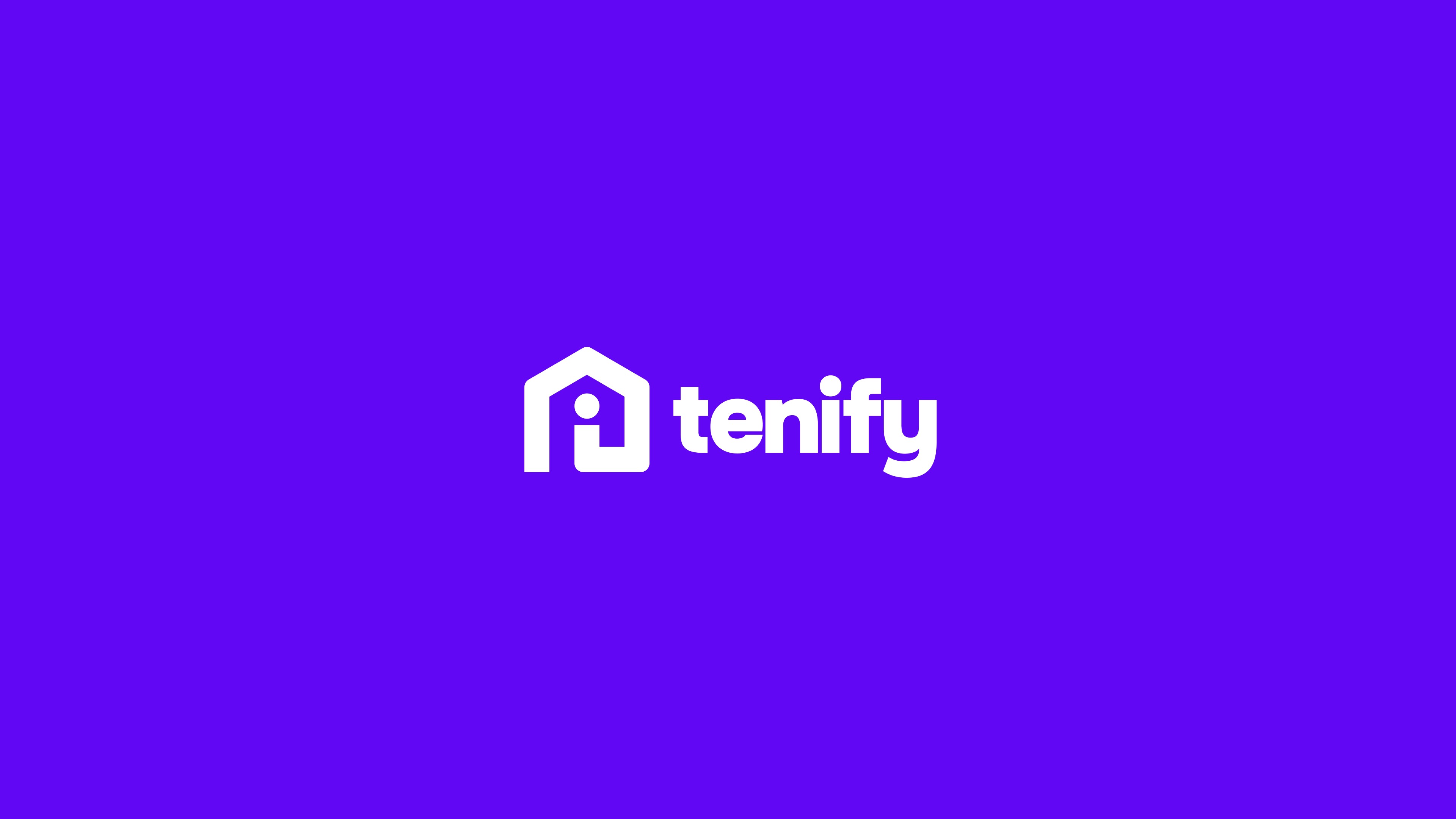
Our brand identity is clean, modern, and tech-savvy, reflecting the simplicity and convenience of our app. The colors should be simple and bold, with a focus on greens, reflecting trust and reliability. The logo should be clean and simple, with a strong, memorable icon that reflects our app's core functionalities.
03
Brand Colour
We love the Sora typeface for it’s softness, rounded strokes, and it’s unique friendly look. It is versatile for display, headlines, digital design, and prints.
Track your expenses, manage your budget, all in one app. Save smarter, not harder, with our app. Sendand receive money with ease, securely.
04
Result
After implementing the new brand identity focused on making financial transactions and management easy, fast, and secure, the results were impressive. The app experienced a notable increase in user engagement, with a significant uptick in downloads and active users. The streamlined and user-friendly interface resonated well with the target audience of young professionals, who appreciated the ease of managing their finances on-the-go.